Home design color theory and how each tones affect emotions and feelings. Colour psychology has a practical, undeniable impact on home design, mood and emotion perception. With the right paint colors, you can relax, unwind, get motivated, or get social. Here is how to use color psychology to create the moods you want in your home:
Understanding Color Psychology
Different colors have different psychological effects and meanings. Knowing these can help inform your decision for setting the right ambiance for each room.
- Blue: Typically viewed as calming and peaceful, blue is great for a bedroom or bathroom. It can reduce blood pressure and rhythm of breathing, and promote relaxation. Pale blues create serenity, dark blues convey elegance and depth.
- Red: An energizing color, red boosts energy and appetite, and is suitable for dining rooms and kitchens. But too much red can feel heavy, so it’s best as an accent or in more social, vibrant places.
- Green: The color of nature and balance, green promotes calmness and relaxation. It’s versatile and looks good everywhere in a home for a crisp, serene feeling.
- Yellow: Happiness and optimism is the simple meaning of yellow; it is bright and cheerful. It can add light to a small space such as a kitchen and make a space happy, but use it in moderation, experts say: Too much saturated color can feel overwhelming or overstimulating.
- Neutral Hues: Whites, greys, and tans provide a classic look. They serve as the perfect backdrop to use with other color and textures, to create balance and harmony.
Colors for Specific Rooms
Knowing how colors make you feel helps you set the right mood in each region of your home.
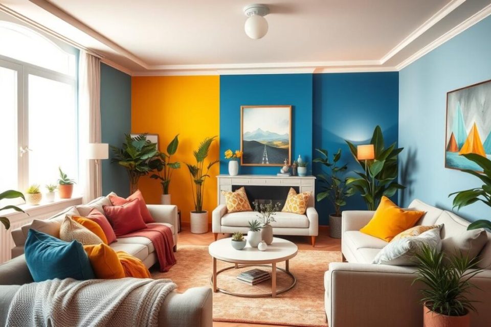
- Living Room: The living room is usually where people gather and hang out. Warm, welcoming hues such as gentle yellows, toned down oranges or warm neutrals can create a comfortable setting. Team with soft cushions in coordinating colours for added comfort.
- Kitchen: The kitchen is frequently the hub of activity in the home, where people gather and hang out. Bright colours such as reds, oranges provide dynamics. For a more soothing kitchen, try green, or light blue accents.
- Bedroom: Bedrooms are places of rest and recovery, so redecoration should include soothing colors such as blue, green, or pale purple. These shades help make the sleeping space a peaceful sanctuary for relaxation and sleep.
- Bathroom: This room doesn’t have to be a place only where you bathe and get ready. Cool blues, greens or grays create a spa-like mood. Add a splash of soft yellow or aqua for a lively, fresh hue.
- Home Office: Use a shade of green or blue to help stimulate your mind for work. These are colors that invoke focus and serenity. Or choose to use more subdued yellows and soft grays which can spark creativity and innovation without being visually overpowering.
- Dining Room and Dining Area: Facilitate pleasurable mealtimes with colors that inspire appetite and conversation: rich reds, deep oranges or warm, earthy colors. If you crave a more subtle ambiance, choose for a classy neutrals or subdued greens.
Tips for Choosing Color Combinations
- Test Colours: Always test paint colours directly on the walls or surfaces to be painted, in the actual environment. Notice how they transform in varied light throughout the day. Using sample swatches or small test pots will save you expensive errors.
- Balance and Harmony: Aim for balance by picking one main color, and then using one or two accent colors. The 60-30-10 rule can help: 60 percent of a dominant color, 30 percent of a secondary one and 10 percent of an accent.
- Think about light: Sunlight and lamps have a major influence on how colors look. A shade that looks amazing in the daylight may look different under incandescent lighting, so try using lighting that will complement the colors you’ve picked.
- Hang Around the Color Wheel: Use the color wheel to find complementary and analogous colors. Contrast is achieved by using complementary colors which are found at the opposite sides of the wheel and harmony by an analogous color which are situated next to each other.
Final Touches
Decor and accessories will complement your paint colors after you choose them. Introduce textures with rugs, cushions and curtains for depth and interest. Personal touches, such as artwork, plants and decorative items, can pull the scheme together and be representative of your personality.
Conclusion
When it comes to our homes, using color to create a certain mood can seem somewhat daunting which is where color psychology can help. Once you understand these effects, you can design spaces that don’t just look amazing they are beautiful spaces that contribute to your wellness and overall productivity. Whether you’re after a sense of peace, vitality or inspiration, the right shades can make your home a place to escape to and recharge in.